Pages:
Author

Topic: : - page 15. (Read 70881 times)

sr. member
Activity: 322
Merit: 251
FirstBits: 168Bc
September 13, 2011, 12:35:18 PM
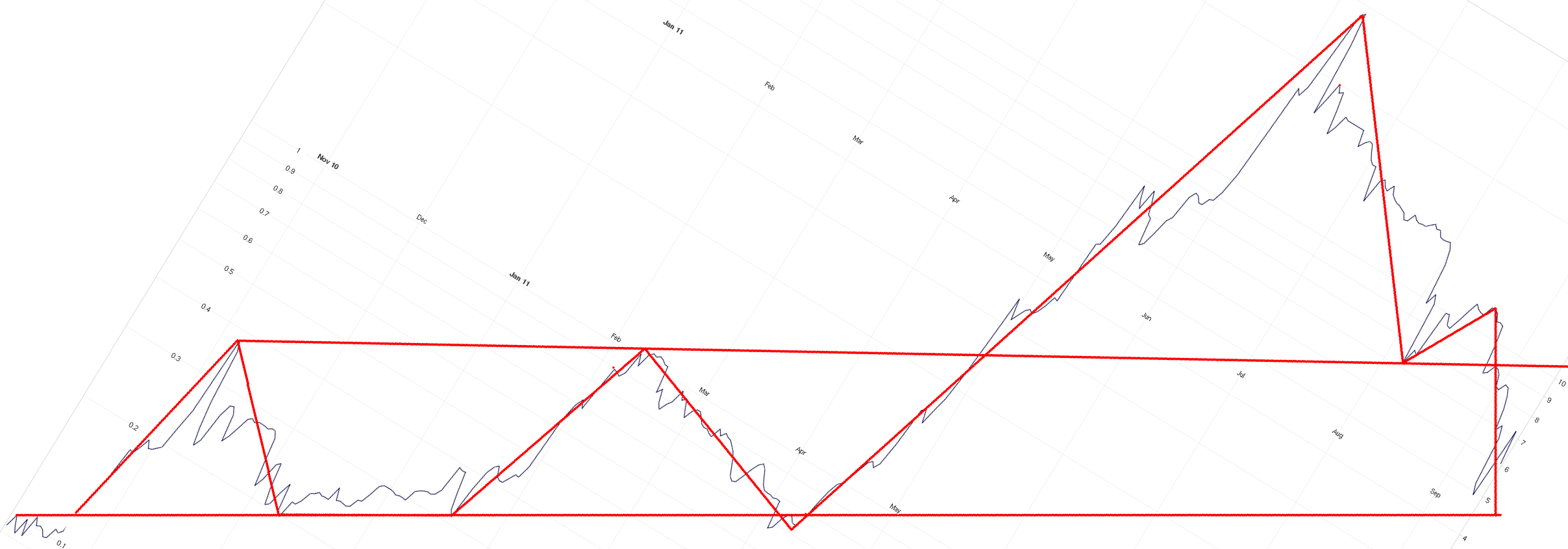
Volatility is so great that trends are essentially meaningless, I don't think that they can be considered predictive...The only conclusion I can come to is that at this time $/BTC is essentially trendless.

What about on monthly scales?
sr. member
Activity: 322
Merit: 251
FirstBits: 168Bc
September 13, 2011, 11:23:29 AM
Compared to the pattern in early August (and June), there have been disappointing rallies to the (red) resistance lines according to my eyeballs (click to expand), though it looks like we're in the fourth Elliott wave of this week's rally.


sr. member
Activity: 294
Merit: 250
September 12, 2011, 11:15:08 PM


I like the new chart format.  Easy to see the important stuff.  THANKS!
sr. member
Activity: 322
Merit: 251
FirstBits: 168Bc
September 12, 2011, 05:19:55 PM


The $9 resistance on 8 August became the support on 12th (falling diagonal) similar to the $5.3 line on 10 September and I hope today.
sr. member
Activity: 387
Merit: 250
September 12, 2011, 07:34:23 AM
interesting point: exponential average 50 crossed simple average 200 with 30 min bars:

sr. member
Activity: 322
Merit: 251
FirstBits: 168Bc
September 11, 2011, 11:55:33 PM


I have learned that eye is quite treacherous when it comes to actually quantifying things like trend probabilities and buy/sell signals from charts.

I don't deny it. And even when things go exactly as planned, the mind changes strategies in fear or irrational exuberance. It's good to have cold calculus and perhaps an automated trade strategy, or so I imagine. Smiley

I feel the eye and mind are better at seeing patterns out of the box. Sure you can develop more sophisticated software at an enormous expense, but our inherent pattern recognition is quite fast, cheap, and programmable, if not reliable. The human can simultaneously see numerous timescales and visualize a future. On the other hand, he is forgetful, undisciplined, and has a wonderful imagination for better and worse.

In this particular case, I perfectly predicted the bounce point above $6 on the 7th, the rise above $7, and the fall to $4.5. Somehow I failed to make the expected killing, but that's a different issue I am working on. The rise back up is following a similar pattern, but gets trapped under exactly one of each of the previous half dozen support lines from August (and Mt. Gox is reporting dubious events that may or may not be happening).

Let us assume that those chart snippits are actually telling the same story, how do you turn that into an actionable trade? By deriving price targets?

Well, there's the rub. I set orders that either don't get filled or were too conservative and I lose terribly chasing the price. But how do you manage that with your probabilities? Set 5% of your wealth where there is 50% probability?

I believe the greatest value of analysis (such as your own, thank you) is in establishing calm confidence. Thanks for the June 13 tip. I've been looking at a few, but I'll give it special note. Cheers!
sr. member
Activity: 322
Merit: 251
FirstBits: 168Bc
September 11, 2011, 06:56:30 PM


I posted this earlier, (and just accidentally deleted the text rather than quoting) because I thought it was relevant to the time series theme. Wouldn't you agree this looks disturbingly familiar?


member
Activity: 238
Merit: 10
September 11, 2011, 05:41:04 AM
Hi chodpaba,

I like your work, though I don't understand that much about that, yet.
So far I have been looking for the standard price changes (high-low, avg) and the trading volume.

In another post I read a comment of yours like: "can't believe anyone is still using the order book."

Can you loose a few words about that? What exactly are these graphics based on? Any literature, wiki-pages or so:)Huh

Cheers,
Harm
full member
Activity: 121
Merit: 100
September 09, 2011, 12:00:30 PM
The left and right antennae of the H-Box plot are the extrema, in this particular case that means the <2% and >98%. The box itself represents the percentile range you describe, as determined by testing.

2% just happened!  Tongue
sr. member
Activity: 322
Merit: 251
FirstBits: 168Bc
September 09, 2011, 10:54:20 AM


Accidentally deleted text Huh OOPS -netrin

The point was the first week of August looks uncannily like the first week of September (give or take a day).
full member
Activity: 121
Merit: 100
September 09, 2011, 09:49:16 AM
Apparently the support curve is demanding some respect.

That's a... unique... way of saying that the bottom just dropped out.
sr. member
Activity: 322
Merit: 251
FirstBits: 168Bc
September 08, 2011, 11:10:04 PM
Ha! You picked up on that...
I'm glad it was intensional. I was worried I might offend. Smiley

Just to get it in my symmetrical skull, is it correct that each box represents the 25%, 50% and 75% 'chance' of each price for the daily low (orange) and high (blue) and the antennae represent not-gonna-happen <1% boundaries? In the above case the 75% low is also the opening price, so it's also 100% impossible for the low to be higher.
hero member
Activity: 952
Merit: 1009
September 08, 2011, 09:59:25 PM
Wanna redo this after what just happened about 45 minutes ago?
sr. member
Activity: 322
Merit: 251
FirstBits: 168Bc
September 08, 2011, 09:42:08 PM
Quote from: Ben Bernanke
-----------------------------------------------------

It is still a work in progress,
I am a long way from running out of tools...

-----------------------------------------------------
Smiley
legendary
Activity: 2100
Merit: 1000
September 08, 2011, 06:21:21 PM
The new chart looks great, but I still think that your model is too rigid and will does not account for the emotional, herding forces that are behind the market. Chart patterns and ElliottWaves do a better job, in my humble p.o.v. Your model might work in 80% of the time when there is almost no movement in prices, but then it is completely wrong when prices move in either direction, smashing through your support / resistance levels, and then make people fall out of the bed when they see that :-)
full member
Activity: 121
Merit: 100
September 08, 2011, 01:52:48 PM
IQR: $6.51-$7.74
Median range: $6.88-$7.61

My interpretation is that we opened near the lows for the day, $7.50 seems easy, and the high end of the IQR appears likely.

I love your work, but hate when your intuition is wrong. Wink Day's not over yet, I guess!
hero member
Activity: 668
Merit: 501
September 07, 2011, 02:17:47 AM
chodpaba, your new graphs rock! they look great!
keep up the good work!
full member
Activity: 210
Merit: 100
September 07, 2011, 02:12:49 AM
If $7.10 is broken there is not much to keep it from going to $7.80.

Someone made a bidwall at 6.66 and this is what made it go up.  It is satan's influence on the bitcoin.
sr. member
Activity: 350
Merit: 250
September 05, 2011, 08:04:29 PM
Apparently, one of my updates got eaten... Here it is again.
For Monday.

IQR: $7.53-10.45
Median range: $7.88-$10.00

The amount of resistance we would have to move through from the day's 'open' suggest to me it is unlikely that anything over $9.10 would be achieved today, but I would not expect the low to be below $7.80... If a decisive move beyond either of these limits happens then lookout...

Lookout.

This is why we are using some more flexible charting tools to predict BTCUSD. Rather than predicting each days range, we predict overall trends and price targets.

It could be as flexible as you would like, if you want 2% bars I can show those too. Incidentally the lower 2% bar for today is $5.08... But there is still strong support at $6.30.

I know it is not a traditional method of presenting the forecast, but it suits my purposes, and is there for anyone else it suits as well.

Suits me just fine. Keeping it simple appeals to me more rather than wordy and lengthy explanations to justify one's own predictions.
full member
Activity: 154
Merit: 100
September 05, 2011, 05:27:29 PM

This is why we are using some more flexible charting tools to predict BTCUSD. Rather than predicting each days range, we predict overall trends and price targets.

And people forget that's the point of charting.  Patterns, once formed, are *lagging* indicators of price.  They're good for confirming trends and forecasting where price *might* go *if* trends remain unbroken.

Some indicators give signals which have a high correlation to a trend reversing.

Chart reading is NOT a time machine.  It's a way to assign probability weights to higher, lower, or same prices over a time interval.

That said chodpaba's charts and forecasts creep me out.  They're eerily predictive.

Pages:
Jump to: